Improve the Service Topology Details Layout for a Specific Service
Created by: Felixnoo
What would you like to be added:
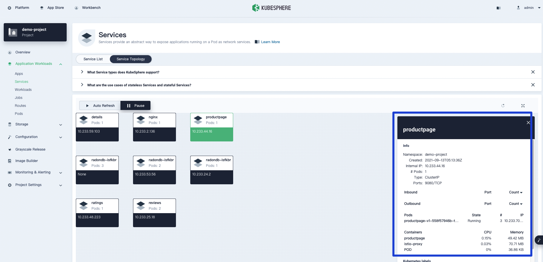
Currently, when clicking a specific Service listed on the Service Topology page, a details form will be displayed on the right as shown in the following screenshot.

The information shown on that form is not organized well and it is also difficult to make Chinese localization.
Please consider improving the layout here.
Why is this needed: For better user experience.